

Why UI/UX Matters More in B2B Than You Think: When Slack redesigned its onboarding flow, it increased team activations by 32%. That’s the power of strategic B2B UI design and B2B user experience, especially in complex industries where decision cycles take longer and involve multiple stakeholders.
For Australian B2B companies, UI/UX for B2B businesses is no longer just about aesthetics. It’s about guiding high-intent users through a logical, trust-building experience that turns curiosity into qualified sales opportunities.
A poor UX/UI design directly impacts B2B lead conversion. According to research highlighted by authorities like Neil Patel, friction in digital flows drastically cuts conversions. Furthermore, HubSpot reports that 88% of online users won’t return to a site after a bad experience.
In B2B tech and enterprise sales, where customer acquisition costs are high, an unintuitive interface, slow speeds, or complex forms mean losing high-value leads to competitors before your sales team even gets to speak with them.
In this guide, we break down ten proven B2B website UX best practices and page patterns that help B2B websites generate more qualified enquiries.
Understanding the B2B Buyer Journey
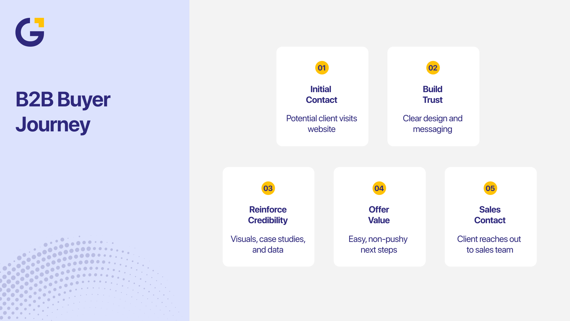
Unlike B2C, the B2B buyer journey isn’t impulsive; it’s strategic, rational, and often committee-driven. A potential enterprise client might visit your site 5 to 10 times before submitting a contact form.
Each touchpoint must:
- Build immediate trust through clear design, robust B2B navigation UX, and concise messaging. You can explore how essential credibility elements function in our guide on Trust Signals Every Sydney Small Business Website Needs Before Customers Enquire.
- Reinforce brand credibility using real data, case studies, and industry-specific proof.
- Offer frictionless next steps that feel valuable rather than overly aggressive.
Leading Australian tech giants like Atlassian, co-founded by Mike Cannon-Brookes and Scott Farquhar, have set the global benchmark for this approach. They design their enterprise landing pages strictly around how decision-makers evaluate and adopt software workflows.
What Makes a Conversion-Focused B2B Page Pattern?
Every high-converting B2B page relies on three fundamental UX principles:
- Predictability & Intuitive Navigation: Visitors should instantly know where to find information and what action to take next. Clear visual hierarchy and structured B2B navigation UX keep users in control.
- Relevance & Context: Content must address the visitor’s specific industry pain points, whether you are catering to SaaS, tech solutions, or industrial B2B sectors.
- Clarity Over Complexity: Every Call-to-Action (CTA) should stand out visually with precise wording (e.g., “Book a Technical Consultation” vs. “Submit”).
Data from the Nielsen Norman Group shows that clarity-driven B2B web designs outperform visually cluttered enterprise pages by 47% in terms of user satisfaction. For a deeper breakdown of heuristics, read our article on CRO Australia: UX & Conversion Strategies Backed by Jakob Nielsen Principles.
10 B2B Page Patterns That Drive Higher Conversions
Converting enterprise buyers requires clarity, authority, and zero friction. Here are 10 high-impact B2B page patterns designed to capture decision-makers and scale your conversion rates.
1. High-Impact Homepage
A high-converting B2B homepage communicates who you serve, what value you provide, and why you are the right choice within 5 seconds.
- Best practices: Use a clear headline, display recognisable client logos above the fold, and feature a single primary CTA. (“Grow your business faster with measurable digital marketing”).
- Example: HubSpot, co-founded by inbound marketing pioneer Dharmesh Shah, balances high-contrast CTAs with clear proof points to guide visitors into trials or demos effortlessly.
2. Problem-Solution Service Page
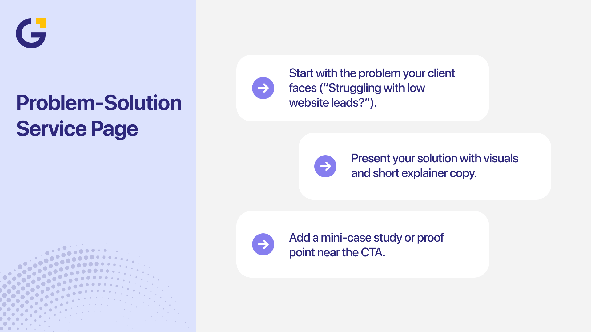
Your service pages act as digital sales reps. They should directly connect client pain points to your actionable solution.
- Best practices: Open with the core challenge (e.g., “Struggling with low website lead conversion?”), Outline your process with clean visuals, and include a relevant micro-case study next to the CTA.
3. Industry or Use-Case Specific Page (UX for B2B Tech & Enterprise)
B2B buyers look for solutions built specifically for their domain. Tailored landing pages for industries like healthcare, fintech, or manufacturing significantly reduce conversion friction.
- Best practices: Focus on sector-specific compliance, unique technical pain points, and targeted testimonials.
4. About/Team Page (Best Practices for Tech & Industrial Automation Companies)
Trust is a cornerstone of B2B transactions, particularly for complex sectors like B2B tech and industrial automation companies. Prospective clients want to verify your operational capacity and technical leadership.
- Best practices for Industrial & Tech B2B About pages:
- Feature authentic team photos instead of generic stock imagery.
- Highlight key leadership bios, certifications, and technical engineering backgrounds.
- Showcase corporate values, facility capabilities, and quality assurance standards.
According to Edelman’s Trust Barometer, 63% of B2B buyers prefer working with companies that demonstrate leadership transparency and cultural alignment online.
5. Data-Driven Case Study Page
Case studies validate your claims with hard data, enabling prospects to visualise their own ROI.
- Recommended Structure: Challenge → Solution → Quantified Results → Client Quote.
- Example: Highlight concrete statistics, such as “How Genix Digital boosted a SaaS platform’s conversion rate by 54% in 90 days.”
6. Product or Feature Comparison Page
B2B decision-makers frequently compare options. A structured comparison pattern simplifies complex technical evaluations.
- Best practices: Use structured feature comparison tables, highlight key differentiators without jargon, and address technical FAQs directly.
- Example: Adobe’s Creative Cloud comparison page uses simplicity and visual contrast to make selection effortless, a model worth replicating for B2B software firms.
7. High-Converting Contact & Inquiry Form Page
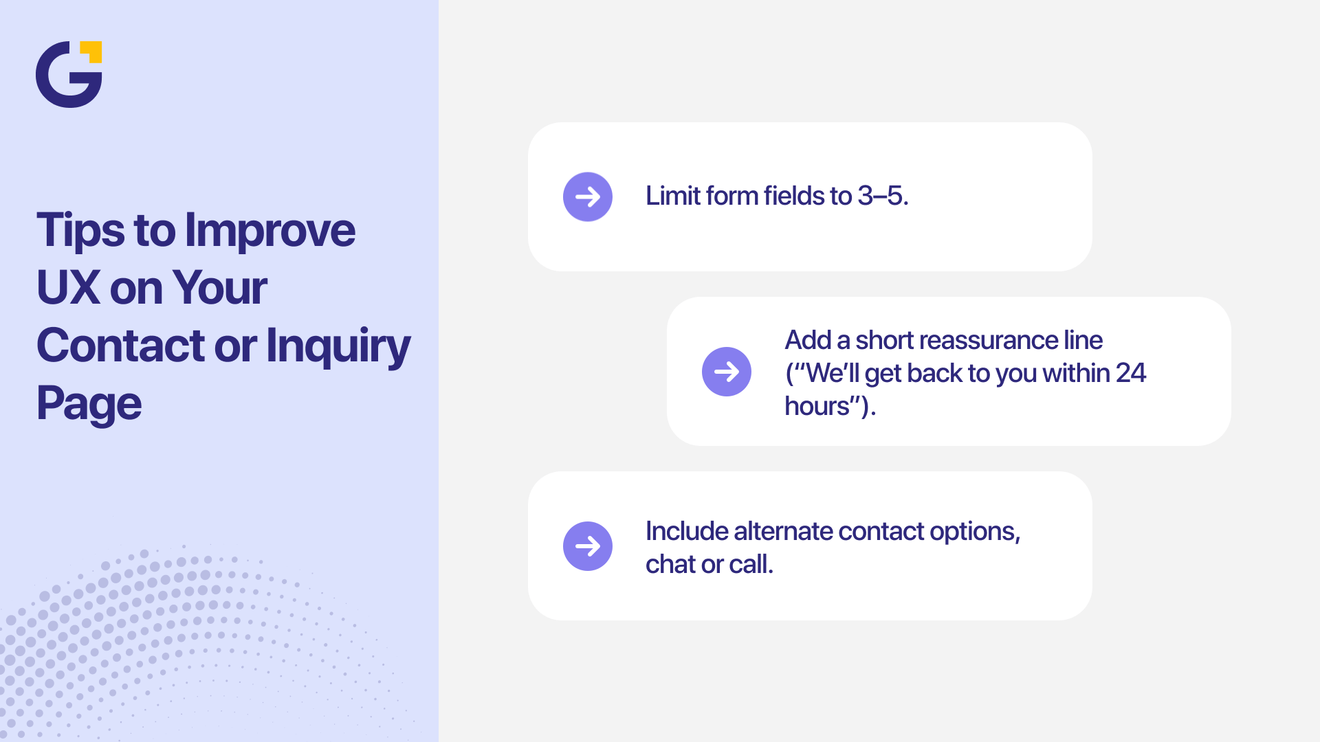
The contact page is often the final step in converting a buyer. Minimising friction here is critical.
- UX Tips: Limit form fields to 3–5 key questions, provide explicit response timeframes (e.g., “We respond within 24 business hours”), and offer direct phone or chat alternatives.
8. Transparent Pricing & Tier Comparison Page
Clear pricing structures build confidence and accelerate the sales cycle by self-qualifying leads.
- Design principles: Highlight feature value before costs, incorporate monthly/annual toggles, and place dedicated CTAs beneath each pricing tier.
9. Distraction-Free Conversion Landing Page
Dedicated landing pages built for paid advertising campaigns or gated assets should isolate a single conversion goal.
- Best practices: Remove top navigation menus, focus on a singular benefit-driven headline, and maintain visual hierarchy focused on the lead form. Check our recommendations on Website Conversion Rate Optimisation for Sydney Businesses before scaling your budget.
10. B2B Platform Redesign & Portal Experience
If you are planning a B2B platform redesign or dashboard update, user experience directly impacts retention and user adoption.
- Best practices: Focus on intuitive onboarding, fast access to core workflows, clear data reporting, and responsive UI elements.
Visual Hierarchy: Guide the eye from benefit → proof → action.
Essential Design Principles for B2B Growth
- Consistency: Adhere to a unified design system across all landing pages and custom web development projects.
- Accessibility: Ensure compliance with WCAG standards for inclusive user access.
- Page Speed: Maintain load times under 2.5 seconds—slow load times drop conversion rates dramatically. Learn more about technical factors in Website Speed Optimisation for Sydney Businesses.
- Visual Hierarchy: Guide the eye seamlessly from primary value propositions to social proof and action items.
Real-World B2B UI/UX Examples
- Salesforce: Uses targeted buyer-segmentation paths and dynamic CTAs.
- Canva for Teams: Built by Australian founders Melanie Perkins and Cliff Obrecht, Canva showcases clean, collaborative layouts that make enterprise onboarding effortless.
- Xero: Simple navigation, high visual contrast, and immediate trust markers.
- HubSpot: Interactive pricing tools paired with contextual case studies.
How Genix Digital Delivers B2B UI/UX Design Services
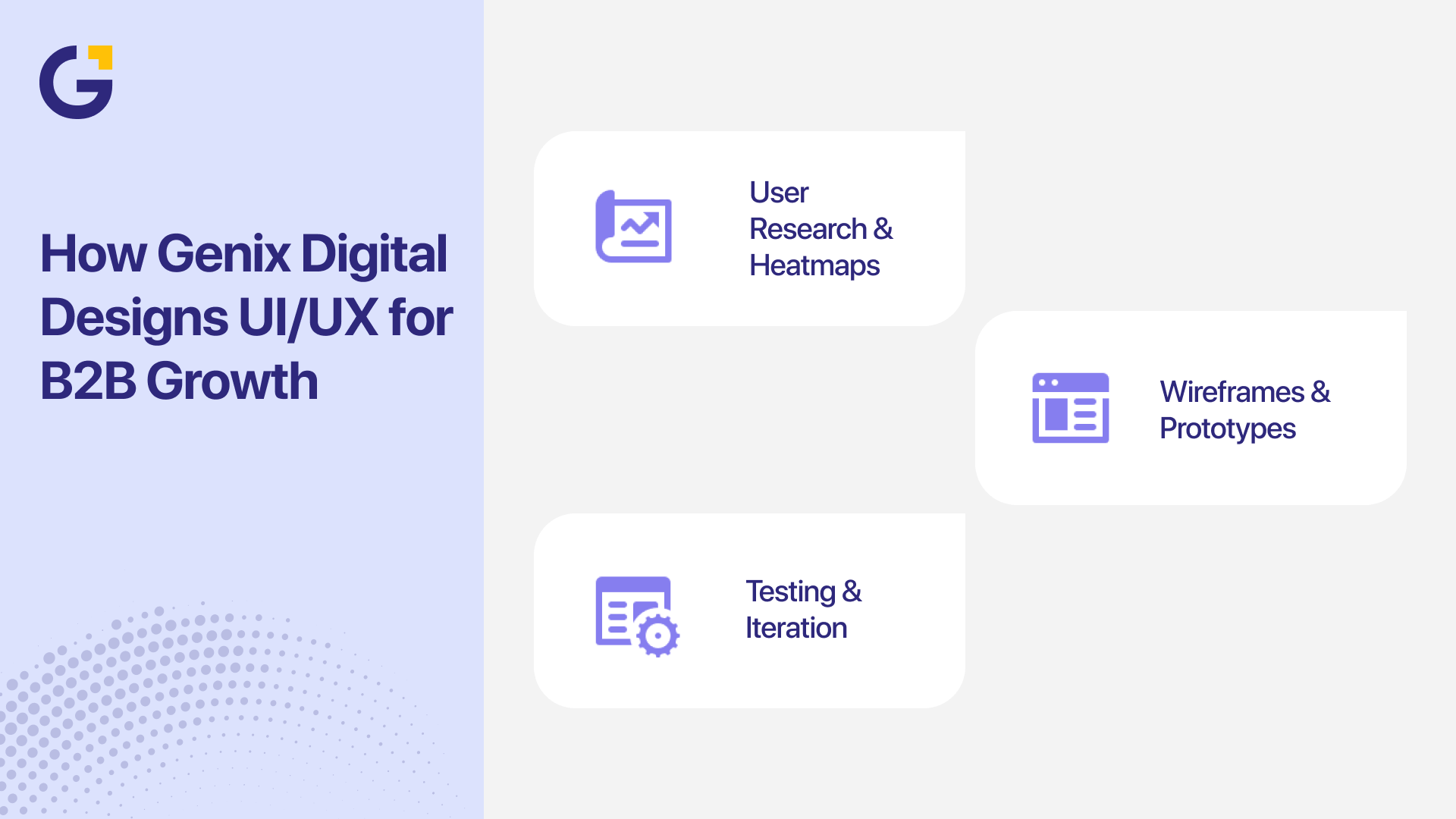
At Genix Digital, we blend user research with performance-driven UX strategy:
- User Research & Behaviour Heatmaps: Analysing how decision-makers interact with your pages.
- UX Audits & Platform Redesign: Identifying friction points through tailored UI/UX design services.
- Wireframing & Technical Alignment: Mapping out conversion-focused B2B navigation supported by robust technical SEO standards.
- Data-Driven Optimisation: Continuously refining UI/UX based on real conversion analytics and written content strategy.
Ready to transform your B2B website into a high-converting growth asset? Book a Free Strategy Consultation with Genix Digital today.
Your Next Step Toward Better Converting Pages
Modern B2B UI/UX is more than visual design; it is a critical driver of business growth. By implementing conversion-focused page patterns, optimising your B2B navigation UX, and addressing the specific needs of your industry, you build trust and streamline the buyer journey.
If you are looking for expert SEO and UX optimisation services for B2B companies, Genix Digital can help. Our Sydney-based team builds custom, high-converting digital experiences tailored to your commercial goals. Contact us today for a free consultation.
Frequently Asked Questions
Why is UI/UX critical for B2B lead generation?
B2B buying decisions involve higher financial commitments and longer evaluation cycles. Strategic UX builds immediate trust and guides multiple decision-makers toward conversion.
How does poor UX design impact B2B conversion rates?
Poor UX creates friction through slow page speeds, confusing navigation, and unclear messaging, leading prospects to abandon your site for competitors.
What are the best practices for an industrial automation company’s About Us page?
Focus on authentic facility photos, technical certifications, leadership credentials, and clear company values to build authority with technical procurement teams.
How often should a business consider a B2B platform redesign?
Major UX updates or platform redesigns are typically recommended every 2–3 years, or whenever conversion analytics indicate friction in the buyer journey.
How can Genix Digital assist with B2B UI/UX optimisation?
Genix Digital provides end-to-end B2B UX/UI design, custom web development, and digital marketing strategies tailored to drive measurable ROI for enterprise businesses.





 13 Mar 2026
 10 Min Read