A business can attract relevant visitors and still receive too few qualified calls, bookings or quote requests. When a website has unclear messaging, broken forms, weak trust signals or inaccurate tracking, increasing traffic may amplify those weaknesses rather than solve them.
Website conversion rate optimisation involves more than changing button colours or shortening forms. For Sydney businesses, it means finding where prospective customers become confused, lose confidence or abandon the enquiry process.
Before increasing spend on Google Ads, Meta Ads, SEO or other campaigns, check whether visitors understand the offer, trust the business, can complete the enquiry easily and are being tracked accurately.
The 15 areas below are not guaranteed conversion improvements. They are issues and hypotheses to investigate using page data, user behaviour, lead quality, booked appointments, sales outcomes and revenue.
Why More Traffic Will Not Fix a Weak Website
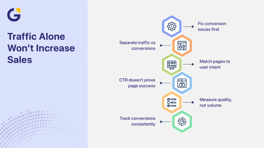
More traffic will not correct an unclear offer, broken enquiry process or unreliable tracking. It may make those problems more expensive because each additional visitor reaches the same weak conversion path. Businesses need to separate traffic quality from website performance and assess both conversion volume and lead quality.
A traffic problem means too few relevant people reach the website. A conversion problem means suitable visitors arrive but do not complete a valuable action. Some businesses have both problems at the same time.
For example, a Sydney plumbing company may attract people searching for an urgent repair but send them to a general services page. The page may discuss maintenance, renovations and installations without showing an emergency call option. The campaign may be attracting the right audience, but the landing page does not match the visitor’s immediate need.
A high click-through rate does not prove that the landing page works. Likewise, a low enquiry rate does not automatically mean the advertising campaign is responsible.
Conversion rate is commonly calculated by dividing completed conversions by a consistent denominator, such as sessions or users, and multiplying the result by 100. The business must define both the conversion and the denominator before comparing campaigns, pages or reporting periods.
A conversion may include:
- A completed contact form
- A qualified phone call
- A confirmed booking
- A quote request
- A consultation request
- A product demonstration
- A purchase
Conversion volume should not be assessed in isolation. A higher conversion rate has limited value when most enquiries are unsuitable, appointments are not attended, or the leads do not produce sales.
This is why it is often sensible to improve landing pages before scaling paid ads. Advertising and CRO can progress together, but decisions become more reliable when the conversion path and measurement setup are working correctly.
When Not to Increase Traffic Yet
A business may not be ready to increase paid or organic traffic when basic conversion and measurement problems prevent it from understanding current performance. These problems should usually be corrected before more budget is committed.
Do not prioritise more traffic yet when:
- Forms, booking tools or phone links are broken
- Conversion tracking is missing, inaccurate or counting the same lead several times
- The mobile enquiry journey is difficult to complete
- Visitors cannot quickly understand the service or offer
- Search terms, advertisements and landing-page messaging do not match
- Most enquiries are outside the service area, budget or customer criteria
- The business cannot connect enquiries with qualified leads, appointments or sales
These issues do not always require advertising to stop completely. A business may continue gathering data through existing campaigns while correcting the main problems. However, increasing spend before resolving them can make it harder to identify what is working and what is wasting budget.
15 Website and Tracking Areas to Review First
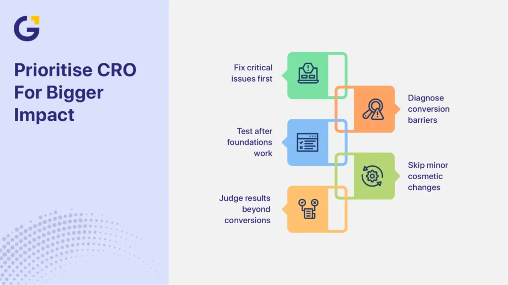
The following areas cover messaging, actions, trust, usability and measurement. Start by correcting clear faults. Then use website and lead data to diagnose weaker areas before running tests.
Use this order:
- Fix first: Correct broken or clearly harmful elements, such as failed forms, hidden mobile CTAs and inaccurate tracking.
- Diagnose next: Use analytics, lead data, heatmaps and user behaviour to identify possible causes.
- Test later: Run controlled experiments after the main conversion path and tracking are reliable.
A recommendation should be treated as a hypothesis until page performance, lead quality and business outcomes support it.
Message Clarity and Above-the-Fold Offer
1. Make the Offer Easy to Understand
Visitors should be able to identify the service, intended customer, problem addressed and next step after a short scan.
Complex services do not need a slogan, but they do need a clear starting point. A vague opening forces visitors to search through the page before they know whether the business is relevant to them.
Ask someone unfamiliar with the company to check the first screen and explain:
- What the business provides
- Who the service is for
- What problem it addresses
- What the visitor should do next
If the answer is unclear, revise the headline, supporting copy and primary CTA. Then monitor service-page conversions, CTA activity and the relevance of the resulting enquiries.
2. Replace Vague Headlines With Specific Messaging
Headlines such as “Solutions for Your Future” or “Quality You Can Trust” communicate little about the actual service.
A stronger headline identifies the service and customer need. Examples include:
- Commercial Cybersecurity Assessments for Australian SMEs
- Sydney Bathroom Renovations Planned Around Your Home and Budget
- Employment Law Advice for Sydney Small Businesses
- Physiotherapy Appointments for Work and Sports Injuries
Specific messaging does not mean making unsupported promises. State the service and expected benefit accurately without guaranteeing an outcome.
Compare results across relevant pages, devices and traffic sources to see whether the revised message improves both enquiries and lead quality.
3. Match the Page to the Search Query or Advertisement
Message match connects the visitor’s original intent with the landing-page promise.
The following elements should support the same need:
- Search query
- Advertisement
- Landing-page headline
- Service explanation
- Offer
- Primary CTA
Consider a Sydney builder promoting commercial office fit-outs. An advertisement focused on commercial fit-out quotes should lead to a page explaining commercial capabilities, project stages, relevant proof and the quote process. Sending that visitor to a homepage dominated by residential renovations weakens the journey.
When reviewing message match, compare conversion rate and qualified-lead rate by campaign and landing page. A page may generate more form submissions, but still perform poorly when those submissions do not match the service.
4. Give Each Page One Clear Primary Action
Visitors can become distracted when several actions have equal visual importance.
A page that gives the same emphasis to “Call Now,” “View Services,” “Download a Guide,” “Book Online,” “Join the Newsletter” and “Request a Quote” makes the visitor decide which action matters.
Choose one primary action based on the page’s purpose. Examples include:
- Request a Quote
- Book an Appointment
- Schedule a Consultation
- Check Project Availability
- Request a Website Audit
Secondary options can remain available. A mobile user, for example, may prefer click-to-call. Track primary and secondary actions separately so they do not hide weaknesses in the main enquiry path.
5. Strengthen the Above-the-Fold Section
The first visible section should give visitors enough information to decide whether to continue.
It will usually need:
- A specific headline
- Short supporting copy
- A visible primary CTA
- A clear visual hierarchy
- One relevant and verifiable trust signal
The trust signal might be an accreditation, review summary, licence, recognised client, project example or professional credential.
Not every visitor must convert without scrolling. The purpose of the first screen is to create enough clarity and confidence for the visitor to continue.
Review this area on real mobile devices as well as desktop screens. A hero section that appears clear on desktop may push the CTA or proof below the visible area on a smaller screen.
Forms, CTAs and Trust Signals
6. Use Specific CTA Wording
“Submit” describes what the interface does, not what the visitor receives. “Learn More” can also be unclear when the visitor is ready to act.
More specific options include:
- Request a Quote
- Book a Discovery Call
- Get an Initial Website Review
- Check Appointment Availability
- Discuss Your Project
- Request a Callback
CTA wording should match the visitor’s level of intent and the commitment required.
Do not judge a CTA only by clicks. A more persuasive button may receive more interaction but attract unsuitable prospects. Compare completed enquiries, qualified leads, appointment attendance and sales outcomes.
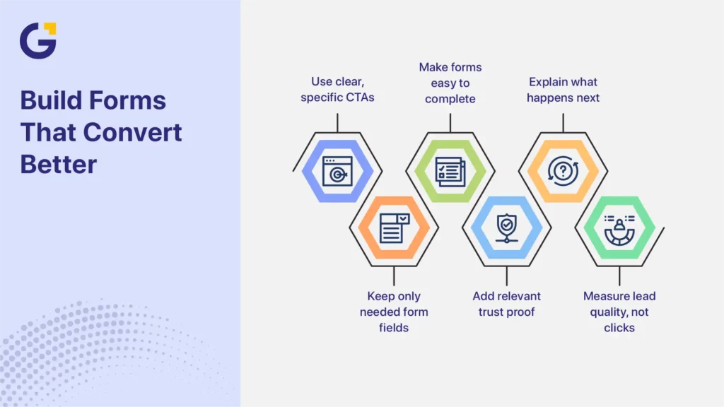
7. Remove Form Fields That Do Not Support the Enquiry
Every required field should help the business respond to, route or qualify the enquiry.
A simple contact request may need only:
- Name
- Contact method
- Service required
- Short message
A complex B2B service may reasonably ask about budget, timeframe, company size or technical requirements.
Shorter forms can reduce effort, but they can also weaken qualification. Longer forms may filter poor-fit leads but discourage prospective customers.
Review:
- Form starts
- Completion rates
- Field-level abandonment
- Follow-up time
- Qualified-lead rate
- Appointment or sales outcomes
The goal is not to create the shortest possible form. It is to ask for the minimum information needed to support the next business step.
8. Improve Form Labels, Instructions and Error Handling
Forms should be easy to understand and complete on desktop and mobile devices.
Use WCAG-aligned form and usability practices, including:
- Visible labels rather than placeholder text alone
- Clear required and optional field indicators
- Instructions for expected formats
- Text-based error messages
- Keyboard access
- Visible focus states
- Suitable tap-target sizes
- Correct mobile input types
- Confirmation messages explaining what happens next
These recommendations align with the WCAG 2.2 guidelines for accessible web content. Do not describe these practices as proof that the entire website is automatically WCAG compliant. Accessibility depends on the wider design, development, content and testing process.
Review form usability as part of broader UI/UX improvements for business websites, not as a cosmetic change.
9. Add Relevant Trust Proof Near Decision Points
Trust signals should be relevant, specific and verifiable.
Useful examples include:
- Genuine customer reviews
- Relevant case studies
- Professional licences
- Industry certifications
- Team qualifications
- Project examples
- Clear business contact details
- Privacy reassurance
- Guarantees with transparent conditions
Place proof near the claim or action it supports.
A construction quote form may benefit from licence information and completed project examples. A healthcare booking page may need practitioner qualifications and a clear explanation of how patient details are handled.
Generic badges, stock testimonials and unsupported claims such as “industry-leading” may weaken trust rather than improve it.
10. Reduce Uncertainty Around the Enquiry
Visitors may hesitate when they do not know what will happen after submitting a form or booking a call.
Clarify:
- Whether the enquiry is free
- Whether there is any obligation
- Expected response time
- Who will contact the prospect
- How long the first call or appointment will last
- What information the prospect should prepare
- How the submitted details will be used
For example, an accounting firm might explain that the initial call is a 20-minute discussion about the client’s situation and does not commit them to an ongoing service.
Monitor form completion, appointment attendance and recurring pre-sales questions. These signals can reveal where uncertainty remains.
Speed, Mobile UX and Analytics
11. Improve the Loading Experience
Page speed should be treated as part of the user journey rather than a competition for a perfect testing score.
Google’s current Core Web Vitals focus on:
- Largest Contentful Paint
- Interaction to Next Paint
- Cumulative Layout Shift
Common performance problems include:
- Oversized hero images
- Unnecessary scripts
- Slow hosting
- Heavy third-party tools
- Unstable layouts
- Excessive fonts
- Poorly configured video or animation
A faster page may reduce friction, particularly on mobile connections. However, speed alone will not solve poor traffic quality, weak messaging, an unsuitable offer or a confusing CTA.
Evaluate speed improvements alongside conversion paths, content clarity, device performance and lead outcomes.
12. Review the Full Mobile Enquiry Journey
A responsive layout does not automatically provide a usable mobile experience.
Test the entire journey on a real phone, including:
- Reading the headline
- Understanding the service
- Opening menus
- Tapping phone numbers
- Selecting CTAs
- Completing forms
- Using booking tools
- Reading validation messages
- Reaching the confirmation page
Text should remain readable, buttons should be easy to tap, suitable keyboards should appear for each field, and pop-ups should not cover important content.
A page may fit a small screen and still be difficult to use. Examine mobile conversion rates, form completions, calls and lead quality rather than relying only on a desktop preview tool.
13. Remove Distracting or Disruptive Elements
Too many competing elements can prevent visitors from completing the primary task.
Potential distractions include:
- Several pop-ups
- Automatic sliders
- Excessive animation
- Multiple sticky bars
- Large chat prompts
- Covered content
- Too many navigation choices
- Layout movement that causes incorrect taps
A chat tool, pop-up or sticky CTA can still be useful when it provides relevant assistance and is easy to dismiss.
Review whether each element supports the page’s main purpose. Remove, delay or redesign anything that interrupts the journey without providing enough value.
14. Track Meaningful Conversions and Lead Outcomes
Conversion tracking should distinguish supporting actions from genuine business outcomes.
Macro conversions are primary outcomes, such as:
- Completed forms
- Qualified phone calls
- Confirmed bookings
- Quote requests
- Purchases
Micro conversions are supporting actions, such as:
- CTA clicks
- Form starts
- Pricing-page visits
- Brochure downloads
- Video engagement
Micro conversions can show movement through the journey, but they should not be reported as equivalent to a completed enquiry or sale.
Configure GA4 key events for the actions that matter, prevent duplicate counting and test every form, call and booking path before relying on reports.
Google Analytics includes several recommended lead-generation events:
- generate_lead: May be triggered when a completed lead action occurs, such as a valid form submission or confirmed consultation request.
- qualify_lead: Usually requires information from the CRM or sales process after the enquiry has been reviewed and accepted as a suitable opportunity.
- disqualify_lead: Usually requires CRM or sales-process information showing that the enquiry does not meet the business’s criteria.
- close_convert_lead: Can represent a lead that later becomes a customer.
- close_unconvert_lead: Can represent a reviewed lead that did not become a customer.
The website can record that an enquiry was generated, but it may not know whether that person was qualified, attended an appointment or produced revenue. Connecting call tracking, CRM stages and sales data can provide a more complete view.
Do not send names, email addresses, personal phone numbers or other personally identifiable information (PII) to Google Analytics. Check event parameters, page URLs, form values and page titles to prevent this information from being collected accidentally.
Tracking requirements can vary based on the business, audience, technology and information collected. Healthcare, legal, financial, and other sensitive-service websites should take particular care with analytics configurations and recorded data.
Accurate tracking also supports clearer decisions about how to improve marketing ROI because the business can connect spending with qualified opportunities, customers and revenue rather than relying on clicks alone.
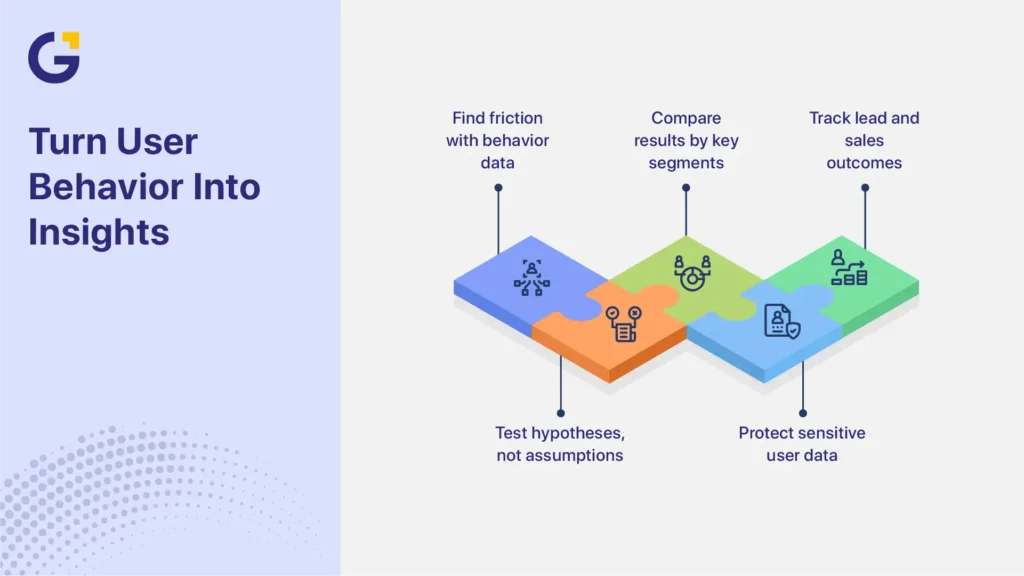
15. Use Behaviour Data to Diagnose Friction
Heatmaps, session recordings and funnel reports can help identify where users hesitate, abandon a page or fail to notice an action.
They do not prove why a visitor behaved in a particular way.
For example, repeated clicks near a heading may suggest that visitors expect an interactive element. It does not automatically prove that making the heading clickable will increase qualified leads.
Use behaviour data to create hypotheses, then compare results across:
- Traffic source
- Device
- Landing page
- New and returning visitors
- Form stage
- Lead quality
- Booked appointments
- Sales outcomes
Heatmaps and recordings should mask form fields and avoid capturing personal, financial, medical or other sensitive information. Review the tool’s masking, consent and recording controls before activation.
Privacy requirements can vary based on the technology, data collected, audience and type of service. Australian organisations should also consider the OAIC’s guidance on data analytics and the Australian Privacy Principles when configuring analytics, consent and recording tools. Use practical safeguards and seek appropriate professional advice where the website handles sensitive information.
How CRO Connects SEO, Ads and Web Design
CRO helps more of the right visitors take action. It cannot compensate for poor targeting, weak demand, or an offer that customers do not want.
For SEO, clear service pages and useful next steps help visitors move from research to enquiry. Organic performance should be assessed by landing page, search intent, conversion action and lead outcome, not rankings or traffic alone.
For paid campaigns, CRO strengthens the connection between the advertisement, landing-page message, offer and CTA. A strong campaign can still underperform when the landing page promises something different from the advertisement.
For web design, CRO prioritises clarity, confidence and task completion rather than appearance alone. Design decisions should support the customer journey and business goal.
Businesses dealing with wider platform, layout or structural problems may need website design and conversion support, rather than isolated landing-page changes.
Which Fixes Usually Matter Most for Service Businesses?
Message clarity, CTA visibility, mobile usability, credible trust proof, form friction and accurate tracking usually deserve early attention. These areas affect whether good-fit prospects understand the service, feel confident enough to act, complete the enquiry and appear correctly in reports.
The correct priority still depends on the page, traffic source and lead outcome.
| Website symptom | Possible issue | First area to review | Useful measurement |
| Relevant traffic but few enquiries | The offer or next step may be unclear | Headline, supporting copy and CTA | Conversion rate and CTA activity |
| Ad clicks but no submissions | Weak message match or form failure | Ad-to-page alignment and form testing | Starts, errors and completions by campaign |
| Calls but few suitable prospects | Expectations or targeting may be broad | Offer detail and call-source data | Qualified-call rate and disqualification reasons |
| High mobile exits | The mobile journey may be difficult | Layout, loading, tap targets and overlays | Mobile calls, exits and form completions |
| Form starts without completions | Form effort or validation may be causing friction | Fields, labels and error handling | Start-to-completion rate |
| Many enquiries but few sales | The offer or CTA may attract poor-fit leads | Qualification copy and lead criteria | Qualified leads, appointments and revenue |
This table provides diagnostic guidance, not proof of a single cause.
Sydney Service-Business Scenario
Consider a Sydney allied health clinic running mobile search ads for initial appointments.
The advertisements generate relevant clicks, but the mobile landing page places practitioner information, appointment types and the booking CTA below a large decorative image. The booking platform also opens in a new window and asks for details that visitors have already entered.
The priority is to confirm that the booking process works and that appointments are tracked accurately. The next step is to diagnose where visitors leave the journey. After those foundations are working, the clinic can test a clearer mobile hero, a more visible booking CTA or a simpler hand-off to the booking system.
Success should not be judged only by booking-form completions. The clinic should also review the right appointment types, attended consultations and patient acquisition outcomes.
A different Sydney business may need a different response. A B2B consultant receiving many unsuitable calls may need a clearer service scope and qualification rather than a shorter form.
When to Redesign Instead of Patch
A redesign may be more efficient when conversion problems come from the website’s structure, platform or repeated templates. Patching usually suits isolated and measurable faults on otherwise sound pages.
A redesign may be worth considering when the website has:
- An outdated or inflexible platform
- Poor mobile structure across most pages
- Slow templates that cannot be corrected efficiently
- Confusing navigation or information architecture
- Inconsistent layouts and CTAs
- Widespread accessibility problems
- Difficult analytics implementation
- Several services competing on one unfocused page
- Positioning that no longer reflects the business
- Frequent technical problems caused by accumulated plugins or code
A redesign is often unnecessary for one weak landing page, a small number of form issues, an unclear hero section, missing trust proof or incomplete tracking.
Do not redesign only to create a newer appearance. Larger structural or platform problems may require website design and conversion support, but the project should have defined goals for clarity, usability, performance, measurement and lead quality.
A Simple CRO Priority Checklist
CRO priorities should reflect risk, evidence and potential business impact. Correct anything that blocks, misdirects or corrupts an enquiry before testing presentation changes.
Fix First
- Broken forms or booking tools
- Incorrect phone numbers or contact details
- Missing mobile CTAs
- Offers that visitors cannot understand
- Severe mobile usability problems
- Slow or unstable landing pages
- Conversion tracking that fails or counts duplicates
- Search, ad and landing-page messages that clearly conflict
Diagnose Next
- Form length and qualification questions
- Trust proof near decision points
- CTA wording and hierarchy
- Navigation distractions
- Mobile abandonment
- Unqualified calls
- Low appointment attendance
- Differences between website, CRM and advertising reports
Test After the Foundations Work
- Alternative headlines
- CTA variations
- Form layouts
- Trust-proof placement
- Page structure
- Offer presentation
- Different qualification approaches
Do not prioritise minor button, colour or layout experiments while forms are broken, tracking is inaccurate, or visitors cannot understand the offer.
A test result should also be reviewed beyond the initial conversion rate. A variation that increases form submissions but reduces lead quality, appointment attendance, sales or revenue may not be a genuine improvement.
Improve Conversion Performance Before Scaling Traffic
Website conversion rate optimisation should start with the issues most likely to block, misdirect or mismeasure qualified enquiries.
Fix broken enquiry paths and tracking first. Then use real visitor and lead data to decide which messaging, form, trust and layout changes are worth testing.
The goal is not simply to generate the highest number of enquiries. The website should help the business attract qualified prospects, generate booked appointments, support sales and produce measurable revenue.
Genix Digital helps Sydney businesses identify where their website and marketing journey may be losing qualified enquiries. During the discovery session, Genix Digital reviews landing-page messaging, ad-to-page alignment, mobile usability, forms, trust signals and conversion tracking. The discussion also looks at lead-quality gaps and whether larger platform or structural problems are limiting performance.
Book a free discovery session to identify which areas should be fixed, diagnosed or tested before increasing traffic investment.
Frequently Asked Questions
What Is Website Conversion Rate Optimisation?
Website conversion rate optimisation improves the percentage of relevant visitors who complete a valuable action, such as calling, submitting a form, booking a consultation or requesting a quote. CRO uses website data, behaviour insights and lead outcomes to identify friction and test possible improvements.
Should I Optimise My Website Before Increasing Ad Spend?
Usually, unresolved website or tracking problems may be wasting current traffic. Broken forms, unclear messaging, weak mobile usability and inaccurate tracking deserve early attention. Advertising and CRO can still progress together while the business improves landing pages and monitors lead quality.
What Affects Website Conversion the Most?
Message clarity, traffic relevance, offer quality, trust signals, loading performance, visible CTAs, usable forms, mobile experience and accurate measurement commonly affect conversions. Their importance varies by service, audience and page, so businesses should diagnose the full journey rather than assume one element controls every result.
Is CRO only for e-commerce websites?
No. Service businesses also depend on conversions, even when no online purchase occurs. Valuable actions may include calls, quote requests, consultation bookings, appointment requests, demonstrations and contact-form submissions. CRO helps make these actions easier while measuring whether the leads are suitable.
How Do I Know if My Website Has a Conversion Problem?
Possible signs include relevant traffic with few enquiries, strong ad clicks followed by few completed actions, abandoned forms, high mobile drop-off, unqualified calls or differences between website and CRM data. These signs require investigation because they do not prove one specific cause.
What Is the Difference Between a Traffic Problem and a Conversion Problem?
A traffic problem means the website receives too few relevant visitors. A conversion problem means relevant visitors reach the site but leave without calling, booking or submitting an enquiry. Review search intent, campaign targeting and traffic quality separately from landing-page messaging, usability, forms, tracking and lead outcomes.
Can Web Design Improve Conversion Rate?
Yes, when web design improves clarity, trust, accessibility, mobile usability and the path towards a useful action. Visual changes alone do not guarantee better results. Design decisions should address an observed user or business problem and be evaluated through conversion, behaviour and lead-quality data.


 13 May 2026
 10 Min Read