

You have seven seconds. That is roughly all the time an online visitor needs to decide whether your business feels legitimate or unreliable. In that split-second window, they are not reading your value proposition or scanning your service list; they are having an instant visual reaction to your site.
This is why website design mistakes are so costly. Unlike catastrophic technical crashes, subtle visual errors rarely make noise. Nobody leaves your site because of one glaring error. Instead, it is death by a thousand micro-flaws: a slightly mismatched font here, a stretched logo there, or a generic stock photo that feels completely detached. Individually, these flaws seem minor. Together, they silently broadcast to prospective clients that your brand cannot be trusted with their hard-earned money, sensitive data, or critical projects.
This article breaks down five of the most common yet most overlooked website design mistakes that erode brand credibility, along with practical fixes to help you turn your site into a genuine trust-building asset.
Not sure if your website is sending the wrong signals? book a free website credibility audit and get a professional second opinion.
How Micro Web Design Flaws Erode Brand Trust
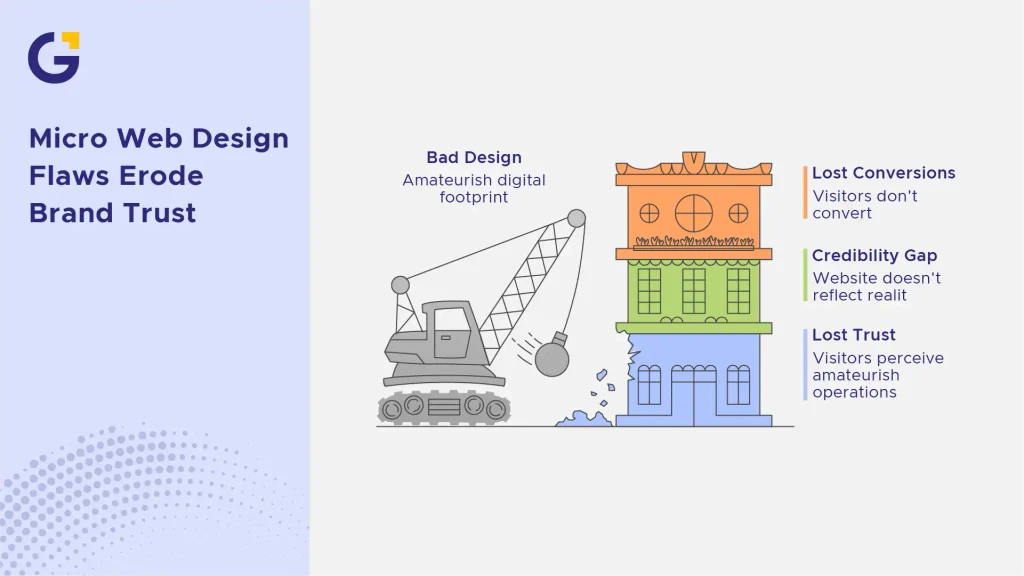
Trust online is built or destroyed in subtle layers. Visitors are not consciously cataloguing your font choices or checking your SSL certificate. However, their brains process hundreds of subconscious trust signals in a fraction of a second.
Research in behavioural psychology consistently shows that people transfer their perception of design quality onto perceived business quality. A business with an amateurish digital footprint is instantly perceived as amateurish in its operations regardless of how skilled or established the company actually is. As Canva co-founder Melanie Perkins famously noted when making visual design accessible to everyone, visual presentation dictates how an audience perceives value and authority.
This is the credibility gap: the difference between how good your business actually is and how good your website makes it look. Addressing these subtle flaws doesn’t always require a total overhaul; often, fixing bad website design examples and structural errors is enough to reclaim lost conversions.
1. Inconsistent Typography and Poor Font Readability
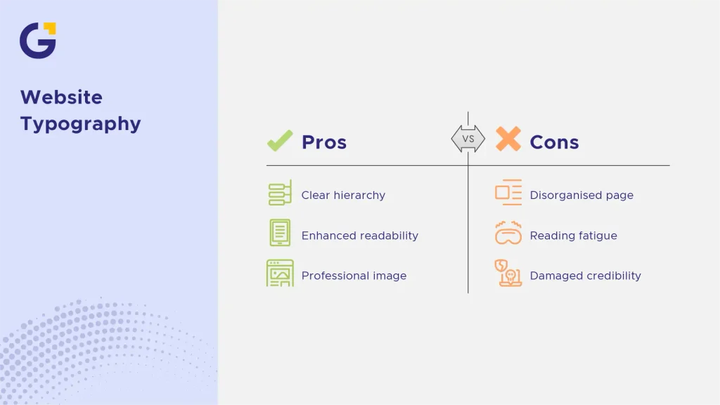
Typography is the visual voice of your website, and inconsistent typography sounds like a business that cannot get its story straight. When headings, body text, and buttons all use different font families, weights, or sizes without a clear visual hierarchy, the page feels disorganised before a visitor reads a single word.
Poor font readability compounds the problem. Text that is too small, suffers from low colour contrast, or is crammed with no line spacing forces visitors to work harder than they should just to understand your offer. When visitors experience visual fatigue, your website retention rate drops sharply.
Example Case: A local law firm’s homepage used three different fonts across its hero section, service cards, and footer, with body text in light grey on a white background. Heatmap data showed visitors scrolling past key sections without pausing, a strong indicator of reading fatigue, not disinterest.
- Stick to two font families maximum: one for headings, one for body text.
- Maintain a minimum contrast ratio of 4.5:1 for body text, per WCAG Accessibility Guidelines.
- Use consistent font sizing across similar page elements (all H2s, all body paragraphs, etc.).
The Hidden Impact of Visual Chaos on First Impressions
First impressions are formed before conscious reading even begins. A visually inconsistent page creates what designers call “visual noise”: a subconscious sense that something is off, even if the visitor cannot articulate why.
This visual chaos does not just annoy visitors; it actively damages website credibility by signalling a lack of attention to detail. If a business cannot maintain consistency on its own website, prospective clients start to wonder what else might be inconsistent: service delivery, communication, or billing.
2. Outdated Visuals and Missing HTTPS Security Signals
Few things kill trust faster than a browser warning. When a website does not support HTTPS, modern browsers like Google Chrome display a stark “Not Secure” warning in the address bar right where prospective clients are looking for assurance.
Beyond security signals, outdated visuals such as low-resolution logos, dated colour palettes, or design trends from a decade ago signal that a business has stopped investing in its own presentation. If you haven’t reviewed your Trust Signals Every Sydney Small Business Website Needs Before Customers Enquire, your site might be quietly leaking qualified leads.
According to Google’s official developer guidelines on HTTPS as a ranking signal, secure protocols protect user data while serving as a direct trust signal.
Example Case: A boutique consultancy lost several qualified leads after prospects reported hesitating to submit a contact form because the browser flagged the site as “Not Secure.” A simple SSL certificate installation and visual refresh reversed the trend within weeks.
- Install and properly configure an SSL certificate (HTTPS); this is non-negotiable for web security and trust.
- Refresh visual elements every 2–3 years to avoid a dated aesthetic.
- Update your logo, colour scheme, and imagery to reflect current brand positioning.
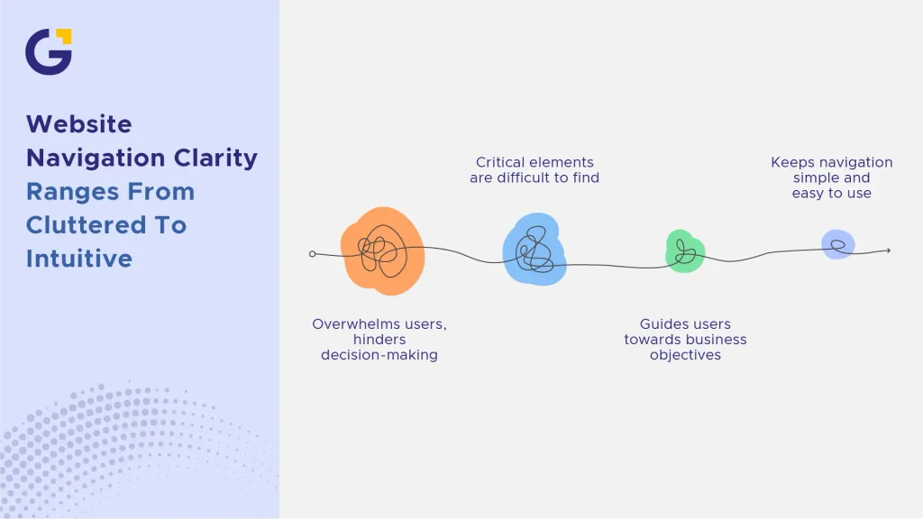
3. Cluttered Navigation and Missing Visual Hierarchy
If visitors cannot find what they need within a few clicks, they quickly abandon the page. Cluttered navigation menus that attempt to showcase every single service on the homepage create cognitive overload. Instead of guiding users, poor navigation choices are major website design mistakes that paralyse decision-making.
A strong visual hierarchy directs the user’s eye naturally from the most important headline down to the call to action. Without deliberate spatial structure, critical conversion elements get lost in the noise.
- Limit main menu items to 5–7 core pages to keep navigation clean and intuitive.
- Use contrasting colours and deliberate whitespace to make primary calls to action (CTAs) stand out.
- Ensure user pathways align with core business goals, whether booking a consultation or requesting a quote.
4. Slow Image Rendering and Broken Layout Alignment
Nothing signals an unpolished business like a layout that shifts unpredictably while loading. When high-resolution images are uploaded without compression, they slow down page load speed dramatically. As images render late, elements on the screen jump around in a frustrating flaw known as Cumulative Layout Shift (CLS).
When layout shifts occur, users accidentally click wrong links or lose their place on the page. This broken alignment makes your platform feel buggy and neglected.
Why Layout Shifts Make Your Business Look Unprofessional
An unstable layout feels cheap. When elements overlap, text breaks onto unintended lines, or mobile views show horizontal scrollbars, it signals that no one tested the user experience.
To avoid conversion loss caused by slow load times and shifting content, ensure your development team prioritises technical SEO and performance optimisation.
- Compress all images to WebP format before uploading to balance crisp visuals with fast load times.
- Set explicit width and height dimensions on image tags to prevent layout jumps during rendering.
- Test your site across multiple mobile screen sizes to verify that alignment remains pixel-perfect.
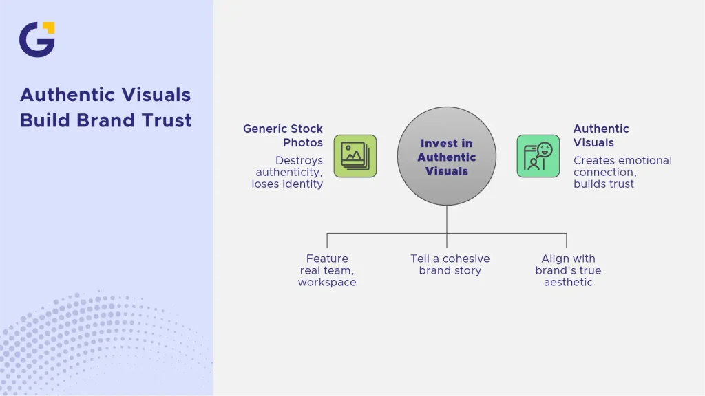
5. Overusing Generic Stock Photos Instead of Authentic Branding
Stock photography has its place, but over-relying on generic images like overly polished models shaking hands in an anonymous boardroom destroys authenticity. Modern web users have developed a sharp filter for “stock clutter” and instantly look past it.
When every competitor uses similar stock assets, your business loses its unique identity. Authentic visuals create emotional connection, while artificial stock imagery reinforces suspicion.
- Invest in professional photography featuring your real team, actual workspace, and genuine client work.
- Combine custom imagery with clear brand messaging and content strategy to tell a cohesive story.
- If stock assets are unavoidable, choose natural, candid visuals that align seamlessly with your brand’s true aesthetic.
Generic imagery is just one component of poor page layout; review if your service page is losing you local clients through subtle structural oversights.
Quick Audit Checklist: Is Your Website Hurting Your Credibility?
Use this quick checklist to evaluate your site’s credibility signals:
- SSL Active: Does your browser show a secure padlock icon (https://) on every page?
- Readability Check: Is your body text at least 16px with strong contrast against the background?
- Mobile Responsiveness: Does your layout adapt fluidly without horizontal scrolling or broken alignment on phones?
- Navigation Simplicity: Can a new visitor find your contact page or core services in under 3 seconds?
- Visual Authenticity: Are your images genuine representations of your brand rather than generic stock photos?
To keep these technical and visual errors from returning over time, follow a dedicated Website Maintenance Checklist for Australian Small Business Websites.
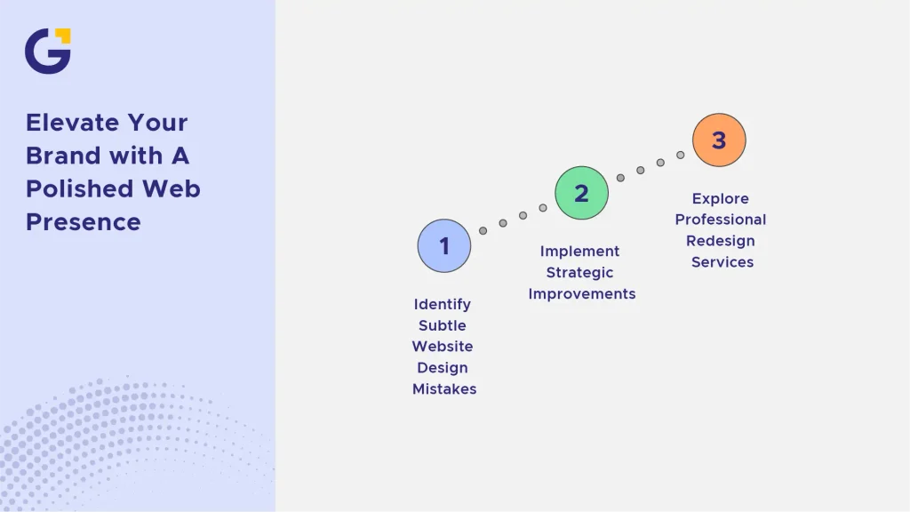
Elevate Your Brand with A Polished Web Presence
Your website is often the very first touchpoint a prospective client has with your brand. While major technical failures are obvious, subtle website design mistakes are the silent conversion killers that quietly drive potential clients toward your competitors.
By refining your typography, securing your domain with HTTPS, streamlining navigation, eliminating layout shifts, and using authentic visual assets, you eliminate friction and build immediate trust. Fixing these micro-flaws transforms your site from a simple online brochure into a reliable growth engine.
If you are planning a complete strategic refresh, explore our custom website redesign services to craft a high-converting, credible digital presence.
Frequently Asked Questions
What are the most common website design mistakes to avoid?
The most common website design mistakes include poor typography readability, lack of HTTPS security signals, cluttered navigation menus, uncompressed images causing slow load times, and heavy reliance on generic stock photography.
How do bad web design examples impact conversion rates?
Bad web design creates visual noise and cognitive fatigue, causing prospective clients to question a business’s professionalism. This friction leads to high bounce rates, reduced time on page, and direct conversion loss.
Why is mobile responsiveness critical for website credibility?
With over half of global web traffic coming from mobile devices, a site that breaks or displays incorrectly on smartphones immediately looks outdated and untrustworthy to modern users.
How often should a business update its website design mistakes?
Businesses should conduct a design and usability audit every 6 to 12 months. Minor layout or typography tweaks can be resolved immediately, while a full visual and structural refresh is typically recommended every 2 to 3 years to stay aligned with web standards.
Can fixing website design issues improve Google search rankings?
Yes. Resolving website design mistakes such as improving page speed, fixing layout shifts (CLS), securing HTTPS, and structuring a clear visual hierarchy directly enhances user experience metrics and technical SEO, helping your pages rank higher on Google.





 15 Apr 2026
 12 Min Read