


If you’ve noticed your website traffic climbing on Google Analytics while your phone stays silent, you’re not imagining it. Most Sydney small business owners are unknowingly failing a mobile UX checklist that determines whether a visitor becomes a customer or bounces within seconds. Mobile users today make split-second judgments, and if your site stumbles even once, they’re gone.
The frustrating part is that many business owners believe their website is “fine” because it looks good on a desktop monitor. But over 60% of local searches in Sydney now happen on a smartphone, and a desktop-first mindset is exactly what’s driving mobile visitors away. To fix this gap, you need a targeted strategy built around modern custom mobile web design Sydney standards rather than basic desktop templates. This article breaks down the five biggest mobile UX failures costing you leads, and gives you a practical checklist to fix them.
Not sure where your website stands? Request a free mobile UX review from our team before reading further, and we’ll flag issues while you read.
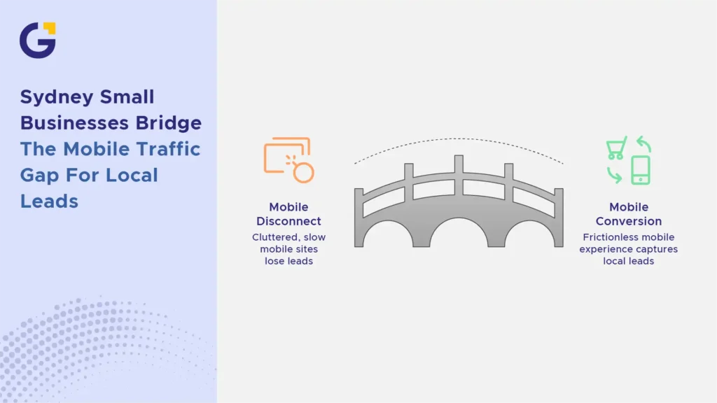
The Reality of Mobile Traffic for Sydney Small Businesses
Sydney consumers are searching “near me” and clicking through on their commute, during lunch breaks, or right after seeing your shopfront. This means your mobile site isn’t a secondary version of your business; it is your business, most of the time.
Yet, a huge percentage of local sites are still built with a “shrink the desktop version” approach. This creates a disconnect between what mobile users expect (speed, simplicity, instant answers) and what they actually get (clutter, lag, and confusion). Without a proper Sydney local mobile SEO audit, many brands continue to lose valuable local leads without realising why.
Example Case: A Bondi-based physiotherapy clinic found that 74% of their website traffic came from mobile devices, but their contact form was only optimised for desktop screens, causing a 40% form abandonment rate.
- Mobile-first indexing means Google evaluates your mobile site as the primary version, not the desktop one.
- Local intent searches (“plumber near me,” “cafe open now”) convert fastest on mobile, but only if the experience is frictionless.
1. Slow Loading Speeds and Core Web Vitals Failures
Speed is the silent killer of mobile conversions. If your homepage takes more than three seconds to load, a large portion of visitors will hit the back button before they even see your offer. Understanding website speed optimisation for Sydney businesses is critical, as server response time and uncompressed media directly impact your bottom line.
Google’s Core Web Vitals Largest Contentful Paint, Cumulative Layout Shift, and Interaction to Next Paint directly measure this experience. You can test your current performance using tools like Google PageSpeed Insights, as failing these metrics doesn’t just frustrate users; it actively suppresses your local search rankings.
Example Case: A Parramatta electrical services company reduced their homepage load time from 6.2 seconds to 2.1 seconds after compressing images and enabling browser caching, resulting in a 28% increase in mobile call clicks within a month.
- Unoptimised images and heavy scripts are the most common cause of slow mobile load times.
- Every additional second of load time can reduce conversions by up to 20%.
How Mobile Speed Directly Impacts Local Conversions
When someone searches for an “emergency locksmith Sydney” at 11 pm, they are not going to wait for your site to load. They will tap back and call the next result. Speed isn’t a technical nicety; it’s a direct revenue lever for local businesses.
Faster mobile pages also lead to lower bounce rates, more pages viewed per session, and higher trust signals, all of which compound into more phone calls and form submissions from your local audience.

2. Tiny Touch Targets and Unfriendly Navigation
Buttons that are too small or placed too close together force users to zoom in or mis-tap, which is one of the fastest ways to lose patience on a smartphone. This is especially damaging for local businesses whose entire goal is a single tap: call now, get directions, or book online.
Confusing hamburger menus, buried contact pages, and multi-level dropdown navigation also frustrate mobile users who expect answers within two taps.
Example Case: A Sydney CBD dental practice increased their online bookings by 33% simply by enlarging their “Book Appointment” button and moving it to a fixed position at the bottom of the screen.
- Touch targets should be at least 44×44 pixels, following official W3C Web Accessibility Guidelines.
- Simplify navigation to 3-5 core menu items for mobile users.
Designing for the “Thumb Zone” on Modern Smartphones
Most people browse with one hand, and their thumb naturally rests in the lower-centre area of the screen. This is the “thumb zone,” and it’s where your most important actions, like click-to-call buttons, should live.
Placing critical CTAs at the very top or far corners of the screen might look clean on a desktop mockup, but it creates real friction on an actual smartphone in someone’s hand.
3. Intrusive Pop-ups and Unoptimized Form Layouts
Nothing destroys a mobile session faster than a full-screen pop-up that hides the close button off-screen. When a Sydney user visits your site looking for quick answers, aggressive lead capture overlays force them to leave immediately.
Mobile forms must also be simplified. Asking for unnecessary details like physical addresses or full company names on a small screen inflates friction. Stick to essential fields like Name, Phone Number, and Suburb to keep conversion rates high.
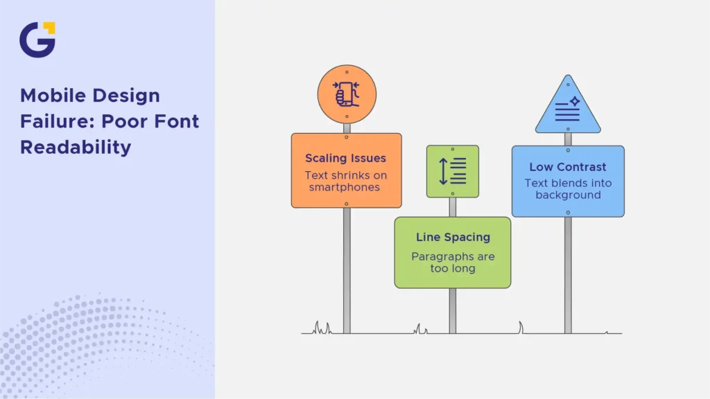
4. Poor Font Readability and Scaling Issues
If a visitor has to pinch and zoom to read your service descriptions, your mobile design has failed. Text that looks perfectly proportioned on a 27-inch desktop monitor often shrinks into unreadable blocks on a smartphone screen.
Mobile typography requires intentional scaling, proper line spacing, and high contrast against the background. Paragraphs should be kept short, no more than two or three sentences—so mobile readers can easily scan your content while on the move.
5. Hard-to-Find Local Contact Details and CTAs
Local consumers rarely browse small business websites for entertainment; they want to solve a problem quickly. If your phone number, service area, or trading hours are hidden inside a sub-menu, you are actively giving business away to your Sydney competitors.
Making Click-to-Call and Map Directions Instant
Australian direct-response marketing expert Sabri Suby often emphasises that reducing friction is the fastest way to double conversions. On mobile, this means eliminating every unnecessary click between a user’s interest and their action.
Your phone number should be a direct click-to-call link, and your address should seamlessly open in Google Maps with a single tap. Placing a sticky bottom banner with instant contact triggers ensures local customers can reach you the moment they decide to act.
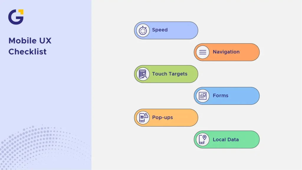
Actionable Mobile UX Checklist for Sydney Business Owners
Use this practical mobile UX checklist to audit your site’s performance today:
- Speed: Does your mobile site load in under 2.5 seconds on standard mobile connections?
- Navigation: Is your main menu concise, easy to tap, and limited to core pages?
- Touch Targets: Are all primary CTAs placed within the natural “thumb zone”?
- Forms: Are contact forms limited to 3-4 fields with auto-fill enabled?
- Pop-ups: Have you disabled full-screen overlays that block mobile viewports?
- Local Data: Are your phone number and address instantly clickable from every page?
Fix Your Mobile UX to Stop Losing Local Leads
A beautiful desktop website means very little if it fails to convert the majority of users arriving on mobile screens. By working through a systematic mobile UX checklist, Sydney business owners can instantly stop lead leakage and turn existing traffic into steady phone calls. Implementing targeted website conversion rate optimisation for Sydney businesses ensures that every dollar spent on attracting mobile visitors turns into actual revenue.
If you want expert assistance refining your digital presence, exploring the main Genix Digital website provides access to full-scale web, SEO, and local growth solutions tailored for Australian businesses.
FAQs
Why are mobile visitors bouncing off my Sydney business website?
Answer: Visitors usually leave immediately due to slow loading speeds, difficult navigation, unreadable text, or hard-to-click buttons that aren’t optimised for mobile touchscreens.
What is a good mobile page load speed for a local business website?
Answer: Ideally, your mobile page should load in under 2.5 seconds. Anything slower significantly increases bounce rates and reduces inquiry forms completed by local prospective clients.
How do I test if my website is mobile-friendly?
Answer: You can use tools like Google PageSpeed Insights and Lighthouse, or manually test your site on various smartphones to check button accessibility, menu navigation, and text sizing.
What is the “Thumb Zone” in mobile UX design?
Answer: The Thumb Zone is the area on a smartphone screen that a user can easily reach with their thumb while holding the phone with one hand. Key buttons and calls to action should always be placed here.
Does poor mobile UX affect my local Sydney SEO rankings?
Answer: Yes. Google uses mobile-first indexing, meaning it ranks your website based primarily on its mobile version, user experience signals, and speed performance.
How can Genix Digital help optimise my website’s mobile experience?
Answer: Genix Digital conducts full UX and technical performance audits to redesign responsive layouts, speed up mobile page loads, and turn mobile traffic into paying customers.





 1 Dec 2025
 13 Min Read